
A braver brand for men's health.
In the men's health space there has been a lot of rapidly emerging tech service solutions, but there are problematic subjects that can be tricky to tackle. For the few brave enough to try, a common 'blokey' style is used to tackle these taboo topics, with a strong insistence on an old gender paradigm that feels a little played out in 2024. Sapyen is a med-tech disruptor that wanted to push against these assumptions and open new conversations in a challenging space with a lifestyle men's fertility brand, so we worked together to develop a thoughtful brand that would help support their early stage investor pitching.
Branding, Identity, digital design, brand position strategy, packaging and instructional design, conceptual marketing and image curation.
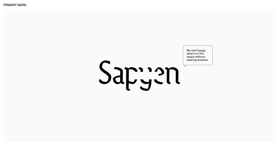
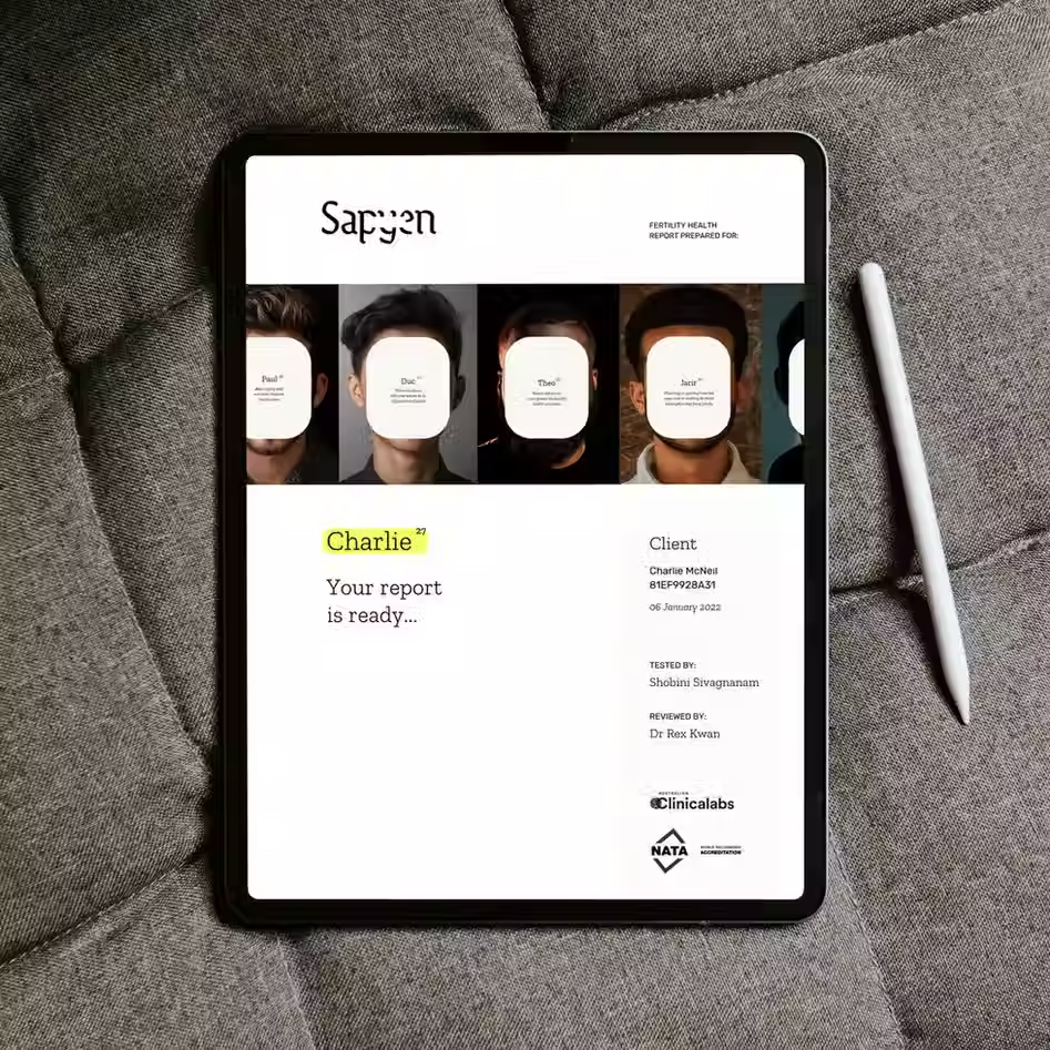
Sapyen provide industry leading at-home testing and analysis for uncovering largely invisible male fertility issues, and we needed to find a way to frame this that felt thoughtful, nuanced and clever—for the kind of men making plans for their future and finding tech-savvy consumer solutions to their problems. We landed on an identity that could span the tonal range from trusted advisor to cheeky friend, playing with cutaways and gaps that speak to ideas of discovery, curiosity, privacy and the unknowable nature of the future yet to unfold. With empathy for what a scary process it can be to get answers when starting a family is hard, we wanted to create a service flow and tone that was credible but not always serious.


